
Understanding the big picture of neck pain

When a person experiences a musculoskeletal problem, whether a sore neck or knee, they try to understand why they have the condition. It helps if the treating health practitioner can put the patient's problem in perspective, so they understand what they are dealing with.
To understand the big picture of neck pain, we need to understand what happens to people over time. People often worry that their condition is going to worsen over time. They might think: “If I have this problem now when I’m 20, what am I going to be like when I’m 60?”
Here’s some information that can help understanding the big picture of neck pain:
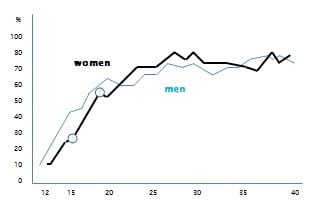
1. Graph 1 shows the likelihood of a person having ever experienced pain in any part of their spine.
The horizontal axis shows the person's age. The vertical axis shows the percentage of people who have ever reported they have had soreness in their spine.
As you can see, there is a rapid increase in reporting of spinal pain between the ages of 12 to 18. There is a more gentle increase in the likelihood from aged 20 to 28. After that the figures don't change much
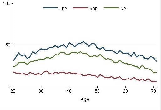
2. Graph 2 shows the likelihood of a person reporting pain in the low back, pain in the mid-back, and neck pain.
The green line represents neck pain. Neck pain is increasingly more likely up until the age of 40, and then gradually reduces in frequency. (LBP is low back pain and MBP is mid-back pain)
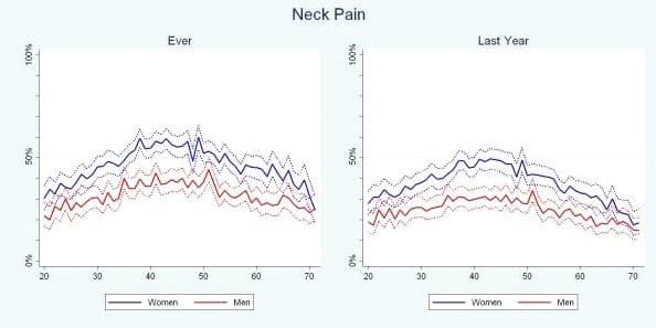
3. Graph 3 splits neck pain by gender – i.e. into men and women. Women are represented by the solid blue line and men by the solid red line. As the graph shows, women are more likely to report neck pain than men.
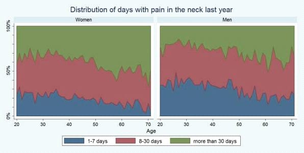
4. Graph 4 presents information in a different way.
Those who do report neck pain have been asked how for many days they had neck pain in the last year.
The green area represents people who say they have had more than 30 days of pain in the last year. As you can see, there is an increase in the number of days of pain reported in women with advancing years, over the age of 50. This pattern doesn't seem to occur for men.
5. Graph 5 shows the percentage of people who say they have reduced their activity levels because of neck pain. This seems to increase over time.

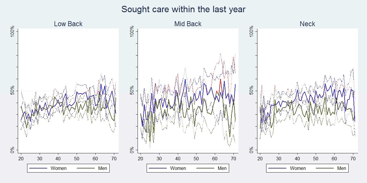
6. Graph 6 shows the percentage of people who have sought health care for their neck problem with in the last year. There is a modest increase in this with advancing years, between the ages of 20 and 50.
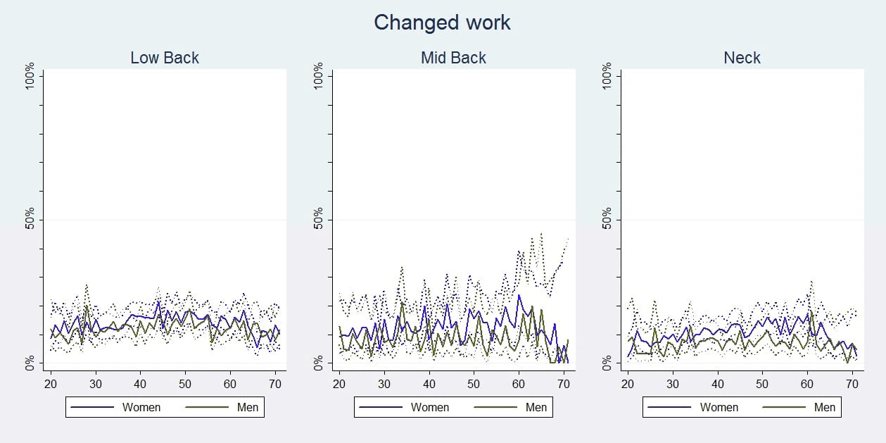
7. Graph 7 shows the percentage of people who have changed their work because of neck pain. This doesn't change much with increasing age.
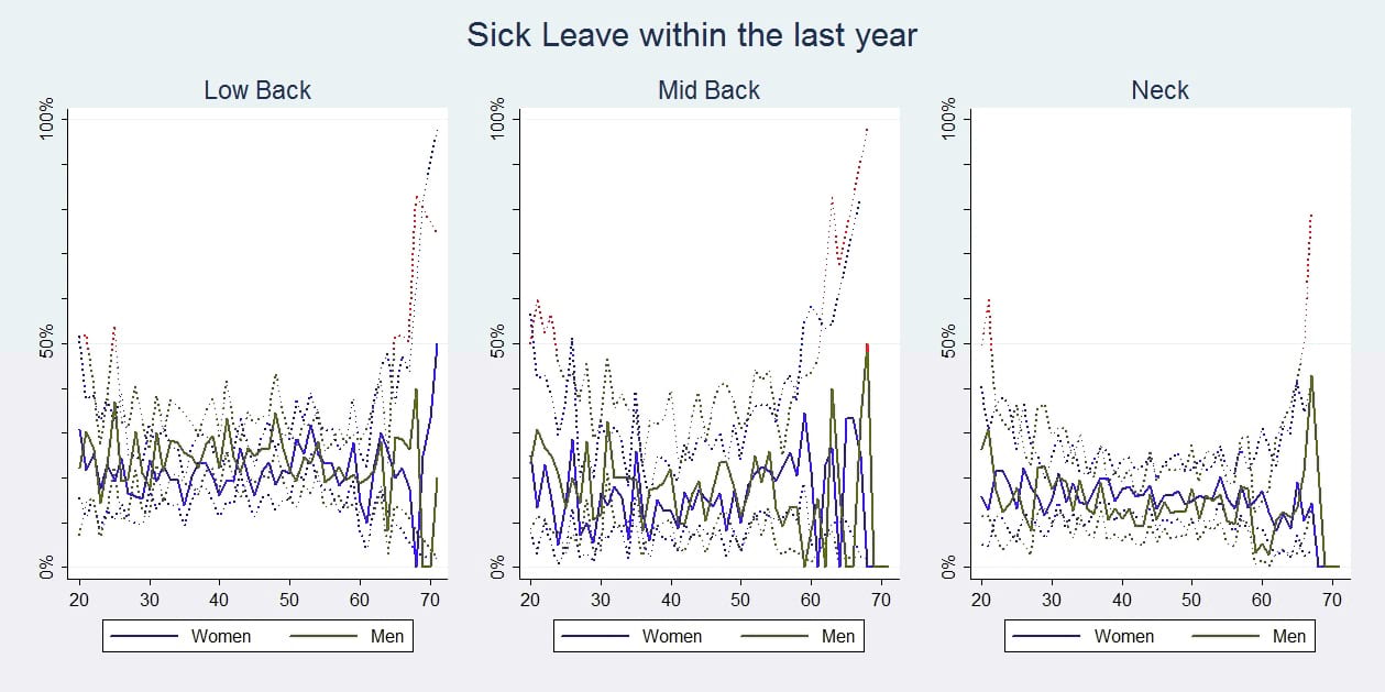
8. Graph 8, the last graph, shows the percentage of people who say they have taken time off work in the last year as a consequence of neck pain.
Once again, look at the solid lines rather than the dotted lines. Taking time off work doesn't increase with advancing age. There is a significant percentage of men having time off work close to the age of 70. However, the numbers in this group are small as not many people are working at that age (for those readers with a statistical bent - the 95% confidence intervals are wide in this age group). As the numbers working in this age group are small, the results are not very reliable in the over 65 age group.
In summary, the likelihood of someone reporting neck pain doesn't increase with advancing years beyond age 40.
The likelihood of people reporting neck pain reduces after the age of 40. Women are more likely to report having neck pain, and women over the age of 40 who say they have had neck pain in the last year have more days of pain.
Those over 50 are a little more likely to seek health care and are a little more likely to reduce activity because of neck pain. They are not more likely to take sick leave as a consequence of neck pain.
So, with increasing age:
- neck pain will be somewhat more likely to last longer.
Otherwise, older people do not:
- have a higher prevalence of pain,
- a larger number of painful areas, or
- more consequences.
And by the way, similar results have been found for the three spinal areas.